Peg It is a laundromat chain, and the promise in the copy is care: that they know what each individual article of clothing needs and will treat it the way you would.
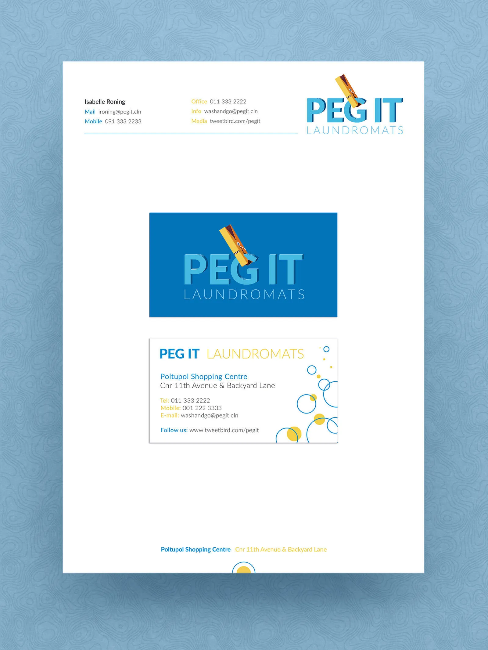
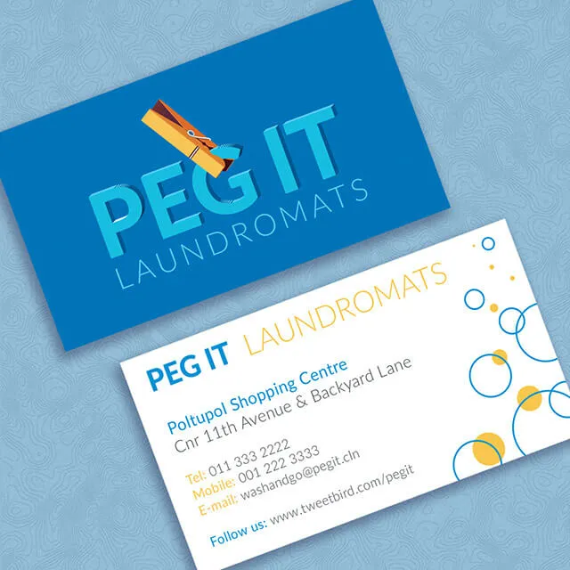
The mark puts a single yellow peg diagonally across the wordmark, clipping the G and the I. It is the one literal thing in the identity, and it is doing two jobs: it names the business without a strapline, and because it is the only element with a real shadow, it sits physically on top of the letters rather than beside them. The rest of the mark is flat, and long soft shadows fall off the capitals in the same direction, so the whole thing reads as cut paper lit from one side.
The blue and yellow are the obvious pair for washing, and the back of the card cashes that in directly: rings and dots for bubbles, in the same two colours, arranged loosely enough to read as suds rather than as a pattern.